Thursday, 13 September 2012

Inspiration : Steampunk Octopus


Photo by ~raybender in Digital Art.
Source : (http://raybender.deviantart.com/art/SteamPunk-Octopus-109981053?q=boost%3Apopular%20steampunk&qo=22)

Coming across this artwork by Ray had inspired me in constructing the story line, maybe it would contribute to our final work if all goes well. The visual above is about 
A giant machine octopus which is attacking freighters and civil cruisers.
Nobody really knows who is behind the huge machine which is attacking the ships for several months now.
because the government wasn't able to react fast enough, the ship owners have hired some brave men and modified some old fishing cutters and equiped them with modern weapons to secure their ships. the unknown attacker seems not very impressed though...  

Lecture : Poster Design


On September 7th we had a lecture on Poster design as well as presenting our work on the expanded squares. This is part of the multiple squares I did, which was in the skull design.


And because I'm not very good with my hands with the littlest details, the skull got pretty messy.


This is me with both of my expanded squares where the one on the right is a "design your own superhero costume" themed and the one on the left is a "dessert" themed.


This was our assignment brief for the day. Since we had extra time we were told to structure a story-line and some other details we would like to add in our movie poster.


These are mine, doing researches and taking down notes.


These are Jowin's, basically on Steampunk history.

The genre we chose for our movie poster is Steampunk. Chi Yan, Jowin and I would be in a group of three..so watch this space for our progress in making our movie poster!

Progress : Expanding Square

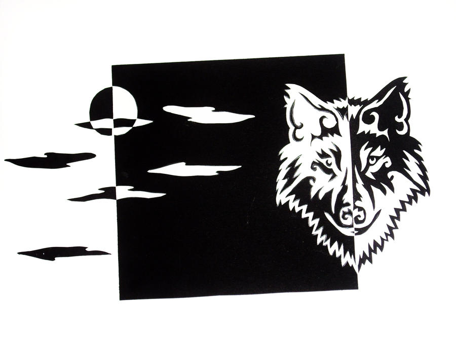
Here are a series of images on my expanding the square, from zero to a product.

The brainstorming of ideas are done after having proper research on notan design and understanding it.

Initial sketch


Wednesday, 5 September 2012

Research : Notan Design

Following up to the lecture we had about positive and negative spaces and we had to come up with out version of the expanded square, I have done some research regarding this as we had to present our final work of symmetrical and asymmetrical squares, and that I felt I didn't do a good job at mine and wasn't on the right track.. I came across a book on Notan Design (notan the dark-light principle of design).

Nōtan is a Japanese design concept involving the play and placement of light and dark as they are placed next to the other in art and imagery.

This use of light and dark translates shape and form into flat shapes on a two-dimensional surface. Nōtan is traditionally presented in paintink, or cut paper, but it is relevant to a host of modern day image-making techniques, such as lithography in printmaking, and rotoscoping in animation.
source  : wikipedia

Here are a few images I've found interesting about Notan Design and think it would be of good help when it comes to me doing mine. (Click on image for source)


A video on Notan Design :


I think I know where went wrong with mine, the mistake I made was not placing the cut-outs next to each other to create the whole effect and understanding Notan / the lecture on expanding the square. What I did was more to stencilling and I think they're two completely different things?

So yeah, the external understanding of this is :

  1. Good design has a balance of light and dark.
  2. Using the Notan concept of light and dark enhances design.
  3. Craftsmanship is essential to good design.

I think learning these basics would eventually lead to us learning about print making (yay!) and I'm looking forward to that.


Tuesday, 4 September 2012

Assessment : V.I.P. (Very Indie Party)


Log : 2 Dimensional Design class on Monday 27th August 2012

Expanding your square : V.I.P. (Very Indie Party)

This was notes I've taken a week before the 27.8.2012 class.

The Expanded Square Lecture notes.

We were told to make our own version of the expanded square.. and these are some very basic sketches of my ideas.


More sketches and expansion(?) of ideas..to get the whole indie effect.


Drafting 

Yoong Ruey on my right side doing his thing.. I really like the whole graphic-ish effect he created. 

Chi Yan on my left side doing her thing. Admire her patience on cutting out the spirals.. *thumbs up!

The Process :


Final Product!

Next would be expanding asymmetrical and symmetrical squares. Looking forward to doing it as I've always liked arts and craft, just not very patient at doing so.

Monday, 3 September 2012

Project x Personal : Stamping on totes

This is a personal mini project on stamping my own "logo" on a plain canvas tote.


//"VICXTORIYA" logo above is adapted from my notebook which I have designed myself quite a while back (refer below)//


Basically I have a plain canvas tote and some alphabet rubber stamps lying around so I thought of printing my name on it, making it more personal in a way. It all turned out well. Its really really easy to make (say, 5mins?) and its really fun!

Inspiration x Project : PARIS; Map for solo travellers


Coming across this map for solo travellers suddenly gave me an idea of creating my own too. Since I come from Johor Bahru and is a sucker for solo travelling, I guess its a good idea to create my own and through it I could introduce Johor Bahru in my own style to the others.

This would be my own personal 2D project (that involves lots of photograph taking (yay!), research and travelling) and hopefully I can come up with it before the 2nd semester ends. #projectJB

Description of the product from the website (buy it here) :


In this map we select 32 things to do in the city of light, none of which involve sharing a bottle of wine, eating bread and cheese on the banks of the Seine, or wandering arm in arm with your loved one. In fact, loved ones do not figure at all, this is a guide for the solo traveler and our suggestions are all best enjoyed on your own – although incurable romantics may wish to bring their partners too, we won't kick up a fuss.
Among the highlights: a taxidermist extraordinaire, mint tea at the Grand Mosque, found photographs at Images & Portraits, along with places to eat, swim, drink, buy vintage erotica and enjoy a solitary ice cream. In short, everything the intrepid visitor might require.
The map is illustrated by Lord Dunsby. It is A3 (297x420mm) folded to A6 (105x148mm), and litho printed on recycled paper.