Sunday, 30 September 2012

Activity : Trial printing

Friday, 28th September. A trial run on stencil printing was done.


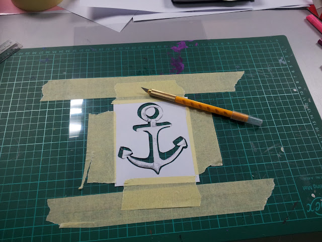
Ms Lisa showing the techniques on cutting stencils out from an acetate.

The anchor was the one I chose, and have printed a few extras one just in case I make a mistake


After much thinking I've decided to play with positive and negative spaces in creating the shape of an anchor.

The green part is the spaces I chose to cut out and to be applied with colour to have a contrast with the uncoloured region.

A grey and purple colour combination test.

I've decided to make a trial cutting on acetate which I got from Shook Leng (thanks shookie!)


Succeeded on my first try!


This time I opted for a nautical colour combination, which enhances the whole sailor-anchor effect. The colours are obviously the classics..red and blue.


Printing time! I've used scrap fabric here and since I have no fabric paint I resorted to poster paints.


Not a bad job though, but it could be better. So far I've been rather pleased. Am looking forward to the next class where we could be printing on any objects of our choice!

Assessment : Creating a monogram

Lecture on Logos and Monograms on the 21st of September.


The class were then told to create a monogram for ourselves. We had to come up with at least 10 of them. These were pictures of my progress.

Its good to have maggi during in class assessments :p


These are all that I've created at the point of time. My designs on the monograms are basically inspired by shapes or designs that existed but I incorporate my initials in the design itself. For me, I like to bring a certain thing to have a much more personal connection to me. As to the designs I've chose such as the diamond, hearts, anchor, infinity symbol, cherry.. they all have a personal significant to me and they mark a journey of my life in different points of time. So I thought it would be nice to have your initials within a "story". 

These are the ones that Ms Lisa chose out of the lot :


 The anchor


The kite.

Although the "kite" has a better potential in creating a monogram but I chose to work on the "anchor" because of the "story" behind it.

Assignment : Project Steampunk : The Beginning

The final art work produced by Jowin, Chi Yan and I. It is titled Project Steampunk : The Beginning. A movie poster we came up with the idea of steampunk elements in it. 

It is basically a movie with a synopsis that goes showing the ugly side of humanity when the apocalypse happened and the birth of a new world, leading them to find the hidden fantasy creatures. The humans then got the creatures to be workers for them, promising a better world and to bring a stop to their hiding. But what the creatures didn't know is the real motive of the humans, that is to use them as slaves to build a steampunk world so the humans could reign over the world. Fantasy creatures are gifted smart, so when they found out that their world is actually being destroyed over saved, they started a war...so that marks The Beginning.

I came up with the initial idea of having a sequel to our project, which we all agreed that by doing that, there will be a story along way the art works, so that it will bring a meaning to the work and to let our audience anticipate what is going to come next. We worked on the initial idea of that and tweaked here and there to have a final outcome of this.


Below are a series of page by page visuals on our little sketchbook documenting our initial ideas from the little characters to the typography to the colour choices.


Monday, 24 September 2012

Progress : Project Steampunk

Visuals on the progress of Project Steampunk : The Beginning. I was in charge of the typography, Chiyan on the background drawing and Jowin on the main body drawing.

The typography I was referring to (in this image) was the initial try out but due to its hasty work we weren't satisfied with it. So I've decided to do it on a clean sheet of A4 paper folded into many halves to form grids, instead of the yellow-ish grid paper I used at first.

Typography reference and duplicates of the steampunk fairy. Just my "work place" from another angle.

Chi Yan doing her thing.. One perspective drawing on cities.


Jowin drawing the "war" happening between humans and fantasy creatures.