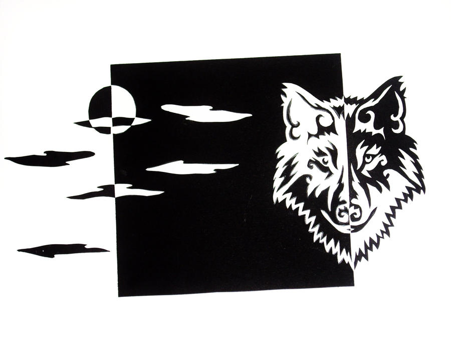
Nōtan is a Japanese design concept involving the play and placement of light and dark as they are placed next to the other in art and imagery.
This use of light and dark translates shape and form into flat shapes on a two-dimensional surface. Nōtan is traditionally presented in paint, ink, or cut paper, but it is relevant to a host of modern day image-making techniques, such as lithography in printmaking, and rotoscoping in animation.
source : wikipedia
A video on Notan Design :
I think I know where went wrong with mine, the mistake I made was not placing the cut-outs next to each other to create the whole effect and understanding Notan / the lecture on expanding the square. What I did was more to stencilling and I think they're two completely different things?
So yeah, the external understanding of this is :
- Good design has a balance of light and dark.
- Using the Notan concept of light and dark enhances design.
- Craftsmanship is essential to good design.
I think learning these basics would eventually lead to us learning about print making (yay!) and I'm looking forward to that.


i really like it
ReplyDeletehey
ReplyDelete